|
自定义ATLAS.ti工作空间
by Raymond C. Maietta, Ph.D
President Researchtalk Inc.
Setting Up The ATLAS.ti Screen For Comfortable Use
No other qualitative software program allows each user to have a unique screen setup. There are an infinite number of ways to customize the ATLAS.ti screen. This wide range of options is designed to meet the preferences of a diverse group of users. Some users will prefer to minimize screen clutter, setting up their screen
with nothing but menus and text visible.
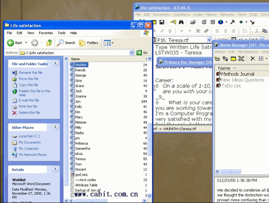
Others may need a setup that facilitates working with more than one program at a time, dragging files into ATLAS.ti from ‘My Computer’ (see the screenshot to the left). Drag files directly into the document manager,the memo manager or even a network diagram. Documents brought into the memo manager become ATLAS.ti memos. Documents brought into the document manager or a network diagram become primary documents.
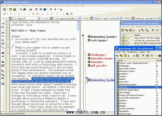
Throughout the life of an ATLAS.ti project any one user may utilize several different screen setups to suit different needs or even moods. If you like to drag-and-drop, you might set your code manager up to the right of your text and margin area as shown in the screen shot here. You can also keep the quotation manager open to name individual quotations or comments.
Consider different options for screen setups. Personal preference and comfort should remain paramount. Think about your preferences for your physical desk. Do you like to avoid clutter? Do you want to ensure the tools you need are within reach?
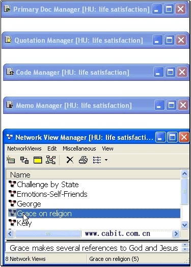
If your answer to each of these questions is yes, then explore “rollup mode.” Rollup mode shows only a
window's title bar until you scroll over it. [The screenshot here shows each primary object manager window (documents, quotations, code and memo) and the network view manager window. The network manager is not rolled up in this screen shot.]
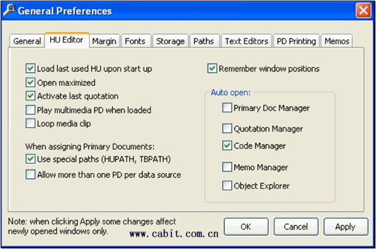
If your answers to these questions depends on your mood, change the look of your project over the course of your work. If you are confident in your preferences in screen setup, go the “extras” menu of ATLAS.ti and explore options in the “general preferences” window. On the 'HU editor' tab, experiment with the options to make your life easier and access to ATLAS.ti features more convenient:
- If you are working on only one HU, you can choose to ‘Load last HU upon startup,’
- Turn ‘Open maximized’ on or off depending on preference to work within a contained screen or to enable access to programs other than ATLAS.ti,
- ‘Activate last quotation’ reopens ATLAS.ti in the same place where you closed the program the last time you used it,
- ‘Remember windows positions’ keeps windows you use in ATLAS.ti in the same place each time you open the program,
- Explore options for the margin area and choose fonts for almost every object and window in ATLAS.ti.
Preferences can also be set for the network diagram, ensuring that each network diagram you open will look the same. Choose preferred colors and sizes for objects and windows. Notice that the screenshot shows the network preference window (available off the specials menu inside any network diagram) in the upper right hand section of the screen. A network diagram is visible in the bottom right section of the screen. Set up what you need, when you need it. Keep a network open to allow you to drag objects in the diagram and open the network preferences window when you decide to make a look of your network permanent.
There are many convenient buttons throughout ATLAS.ti that will let you immediately alter screen options to keep important information visible or hidden. The table pictured below shows what these buttons look like,where to find them and why you might use each one.
| 按钮或上下文菜单 |
哪里? |
为什么? |
| Toggle line numbers |
Sixth from the bottom of
the primary document
toolbar on the left side of
your screen. |
To display a number after each hard
return to the left of document text. |
| Toggle margin display |
Fifth from the bottom of the
primary document toolbar
on the left side of your
screen. |
To turn the display of objects in the
margin to the right of a document on
and off. |
| Display quotations and cursor
position |
Second from the bottom of
the primary document
toolbar on the left side of
your screen. |
To display all quotations that exist at a
specific location highlighted in a
document. |
| Zoom PD |
At the bottom of the
primary document toolbar
on the left side of your
screen. |
To increase the size of PD content |
| Toggle Always on Top |
On toolbars in most
windows, note that you may
need to maximize comment
windows to see this button |
To allow a text editor or window to
always float on top of your screen. This
function is very useful when moving
back and forth between different
windows. |
| Roll-up mode on the windows
system menu |
Off the windows system
menu in the upper left hand
corner of a window. |
To save screen space when working
with several windows open at one
time. |
| Margin area context menu |
Right click in the blank
space of the margin area. |
To personalize the display in the margin
area. Choose to display only the items
that are important to you. |
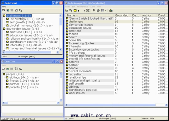
If you are coding, you can display your codes alphabetically in the code manager as depicted on the right side of
the screen shot here. You can use the code forest to show your codes in outline format as shown in the upper
left hand side of the screen or show only a small group of codes in a code tree like the section of codes called
“people” visible in the bottom left hand pane of this screenshot.
Your decisions on screen setup make it easier for you to focus on the substance of your work and your reactions
to what you see and read. Explore different options. If you don’t use buttons to execute functions, close the
toolbars of ATLAS.ti. If you like to drag-and-drop, strategically place your managers and consider using rollup
mode. If a window you need to use disappears every time you move to a new window, use ‘always on top’ to
keep that window open. Suit yourself and design your own unique ATLAS.ti workspace – and enjoy your
research!
在线留言
尊敬的客户朋友,如您有任何意见建议,请通过下表反馈给我们,我们会尽快与您联系。
|